


Stop Chasing Dashboards!!! Start Defining KPIs.
Vol. 7: From messy metrics to aligned teams, this edition shows you how to build dashboards that drive real decisions — not endless debates.


Welcome back to The Datapreneur — your go-to source for sharp, actionable insights on data and decision-making.
I write this newsletter for founders, operators, and analytics pros who want to cut through the noise and make smarter decisions, faster. These aren’t theories. They’re patterns I see inside real companies, after working with more than 50 teams over the past 16 years.
TLDR
This week’s issue dives into why most startups don’t need more dashboards, but better KPI processes. Here are the main takeaways to help you avoid endless debates and build tools your team can actually use:
Don’t build dashboards without clearly defined KPIs — it leads to chaos and wasted time.
Align key metrics and their calculations with all teams before visualizing data.
A good dashboard answers critical business questions, not everything at once.
Without shared KPI definitions, dashboards spark endless debates instead of decisions.
Start with team interviews, key questions, and clear definitions — then build your system.
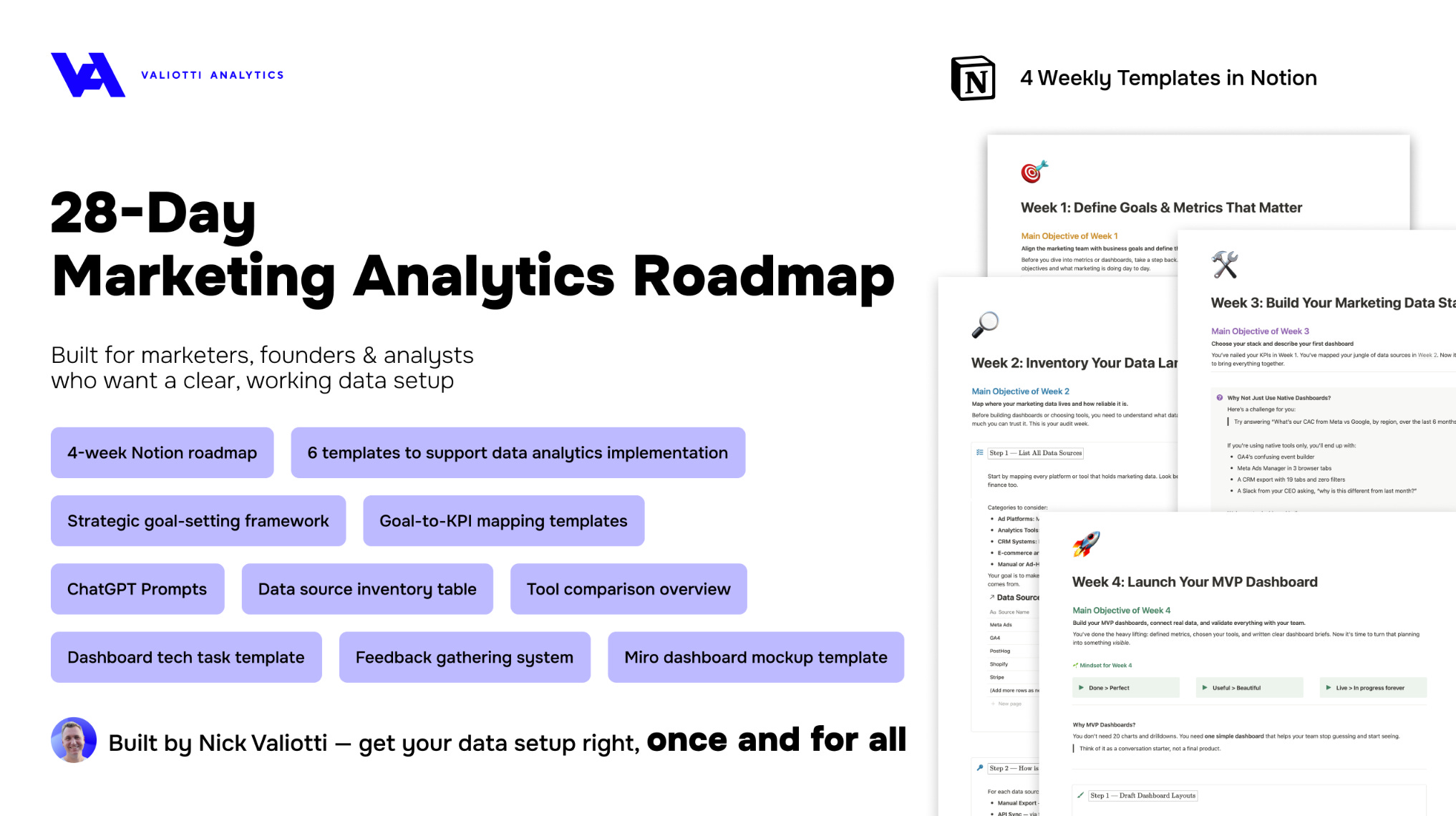
Plus: a clear 4-week roadmap to help you define KPIs, align your team, and build dashboards that actually drive decisions — free in this issue.
Founders LOVE dashboards
They picture one sleek screen with CAC, ROAS, MRR… all updated in real time. One place. One truth. One click away.
But here’s the reality:
Most startups asking for a dashboard are actually asking for clarity.
What they really need is a KPI process — a way to define, calculate, and align on what matters before any dashboards are built.
How the conversation usually goes
→ “We’re spending money on campaigns and don’t know what’s working.”
→ “There are 10 spreadsheets. No one trusts any of them.”
→ “We just want one place to see everything.”
Totally fair.
But dig deeper and the real problem appears: there’s no agreed-upon way to calculate key metrics.
Every team builds reports differently. No one speaks the same data language. Decisions get delayed.
The invisible gap: KPI chaos
Before building anything visual, ask yourself:
→ Do we actually know which metrics matter most?
→ Do we have clear, shared definitions?
→ Do we know how they’re used day-to-day?
Most teams don’t. So dashboards become debates:
“Why is CAC different in this report?”
“Why is this number green here, but red there?”
One lesson to learn here —
What looks like a data problem is usually a KPI process problem.
“OK, nice, but what do I do with this — how do I get to building dashboards? — you’ll ask, — I still need them.”
Here’s my rule:
Never visualize what you haven’t defined
This one simple rule saves you plenty of time and money, trust me. I’ve followed it for over 16 years and tested it inside more than 50 companies. At Valiotti Analytics, my data consulting firm, we always start with stakeholder interviews. We ask:
What decisions do you make every week?
What signals tell you something’s wrong?
What actions would you take if a number dropped or spiked?
Only after these conversations do we start designing any system.
Because once you have clear answers, you need a practical way to turn them into an actionable KPI process. That’s exactly what our framework does.
Take the example below — a dashboard we built for our client:
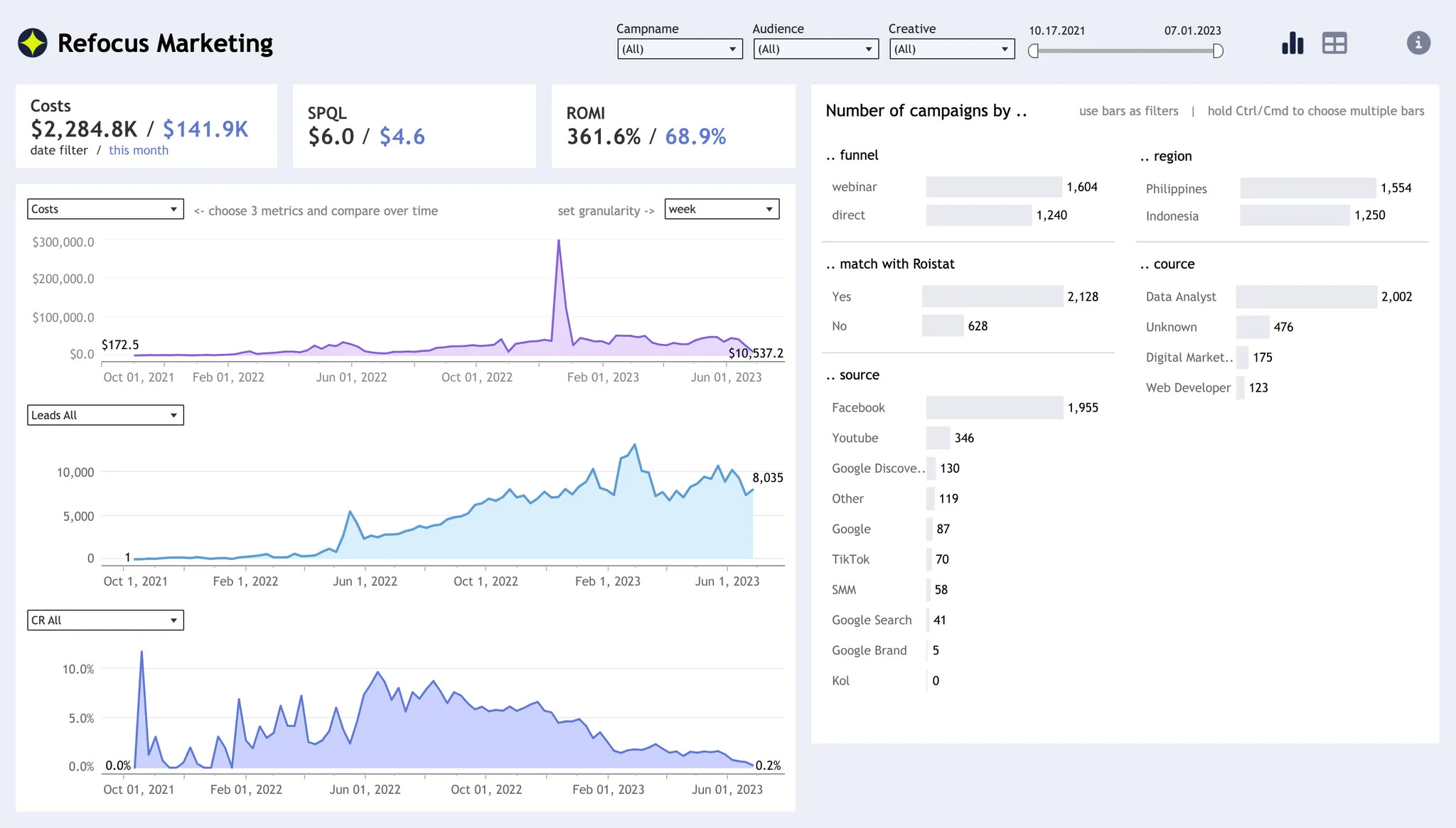
This dashboard wasn’t created in a vacuum. Before building it, we worked closely with the team to define their key questions:
How are campaign costs trending over time?
Which sources drive the most leads?
Where do conversion rates break down?
Every metric you see here — from CAC and SPQL to ROMI — is grounded in shared definitions the team agreed on upfront.
Interactive breakdowns by funnel, region, source, and role let stakeholders slice data the way they think about the business, without creating confusion or misalignment.
Because we defined what mattered first, the dashboard became a decision-making tool — not just a collection of charts.
And when everyone understands how each metric is calculated, the conversation shifts from “What does this number mean?” to “What do we do next?”
That’s what a great KPI process makes possible.
The framework we use
In our 28-day roadmap to marketing analytics, we guide startups through a simple KPI setup:
1. Define goals → for example, grow paid signups, improve activation
2. Map critical activities → paid acquisition, onboarding
3. List outcome and input metrics → CAC, ROAS, conversion rates
4. Clarify definitions → documented logic, business glossary
5. Design the reporting layer → Notion templates, mockups, dashboards
This way, founders know:
What to track
Why it matters
How to act on it
Want the full template?
Grab the 28-day roadmap here — it’s free.
What I’d do as a Fractional Head of Data
If a startup brought me in with zero metrics, here’s what I wouldn’t do:
I would NOT open Looker or Power BI.
I would NOT ask for API keys.
Instead, I’d talk to marketing, sales, product:
→ What are you responsible for?
→ What do you report upward?
→ What do you wish you knew before making decisions?
Then I’d sketch 5 to 10 high-leverage questions. Here’s an example of 3:
How are leads converting by channel?
Which campaigns bring the most retained users?
What’s the true CAC by cohort?
From there, metrics become obvious.
Dashboards become inevitable.
Chaos becomes a system.
Final thought for founders
Stop asking for dashboards.
Start asking:
What are the three numbers I need to see every Monday to run my business?
Once you know that, building the dashboard is easy.
Free resource
If you’re a founder or marketer and want a structured way to set up your first KPI system:
Grab our free 28-day roadmap to marketing analytics — it includes Notion templates, examples, and a checklist you can implement this week.
Weekly Roundup
Every week, I highlight a few standout posts that sharpen your thinking about data, marketing, and decision-making. This week’s picks continue the conversation on dashboards, metrics, and the hidden traps teams fall into when chasing clarity without alignment.
1. Can you build a dashboard?
Read the post →
Why a dashboard might not be what you actually need — and how skipping clear KPI definitions wastes time and money.
2. Data requests in the wild
Read the post →
A hilarious look at unrealistic asks analysts get daily, proving why aligned metrics are essential to avoid KPI chaos.
3. Marketing isn’t underperforming — your planning is
Read the post →
A sharp take on how bad targets set teams up to fail — and why clear, realistic KPIs are the foundation of any useful dashboard.
That’s it for this week
Thanks for reading The Datapreneur — I hope these insights help you bring more clarity and alignment to your metrics, dashboards, and decision-making.
Remember: defining what matters is always the first step toward building systems you can trust.
If you enjoyed this issue, feel free to share it with a colleague or drop me a note — I always love hearing what challenges you’re facing on your data journey.
See you next week with more ideas and real-world patterns to help you turn data into decisions.