
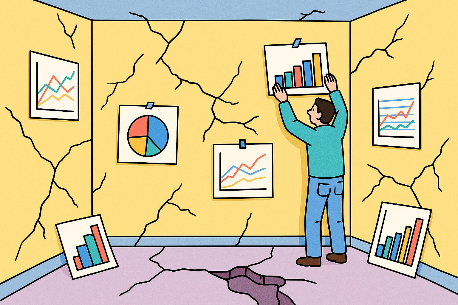
Why Most Dashboards Fail Before They're Built
Vol. 12: If you don’t know what “good” looks like, no dashboard will help.

Welcome to The Datapreneur — the newsletter where we stop guessing, start measuring, and build data systems that actually work.
This week’s issue is for anyone who’s ever been asked, “Can we get a dashboard for that?” — before anyone even knew what that was.
It’s also a cautionary tale. Not about dashboards, but about the urge to visualize data before deciding what success even means.
I’ve seen it across industries — SaaS, eCom, B2B, EdTech:
→ Revenue dips
→ Slack panic ensues
→ Someone says “We need a dashboard”
Wrong question.
Let’s unpack why.
TL;DR
Dashboards are tools, not magic.
And most teams start using them before they know what they’re measuring.
That’s why dashboards often lead to:
→ Confusion
→ Mistrust
→ Endless rebuilds
Here’s how to flip the order — and build dashboards that actually work.
The Dashboard Reflex
Dashboards rarely get built during calm, high-growth periods.
They show up in moments of panic.
The paid campaign stalls.
The revenue graph dips.
The investor asks a question the team can’t answer.
Suddenly, there's a scramble:
“We need a dashboard. Fast.”
The thinking is understandable: more data = more clarity.
But here’s the trap — the dashboard becomes a reflex, not a solution.
In these moments, teams skip past the hard questions —
What’s actually broken? What are we trying to achieve? What decisions are we struggling to make?
Instead, they rush to visualize everything, hoping the answer will reveal itself somewhere in the charts.
The result?
A beautiful dashboard no one uses.
A Slack thread full of conflicting interpretations.
And another executive asking, “Wait, didn’t we already build this?”
The dashboard didn’t fail because it was poorly designed.
It failed because no one agreed on what success looked like before building it.
So you end up with a prettier version of the problem, not a path to the solution.
The Real Problem
I’ve seen this play out dozens of times. Different company, same chaos.
A team hires a BI freelancer to build a performance dashboard.
Then hires an agency to build a “marketing dashboard.”
Then the CTO spins up something in Metabase “just for internal use.”
Now they’ve got three dashboards for the same team.
Each one looks polished. Each one shows a slightly different number for the same KPI.
→ One says revenue is up 8%.
→ One says it’s flat.
→ One doesn’t even show revenue — just clicks and impressions.
The CMO picks the one that supports their narrative.
The CFO refuses to use any of them.
And the team on the ground?
They stop checking altogether.
That’s not a visualization issue. It’s a strategic breakdown.
Because no one ever asked the foundational questions:
What exactly are we trying to measure?
How do we define success — not just in marketing, but across the org?
What metrics do we trust enough to make real decisions?
When those questions go unasked, dashboards become political.
They’re not tools — they’re optics.
And when trust erodes, even the right numbers stop mattering.
This isn’t a dashboard problem.
It’s a success-definition problem.
You can’t measure progress toward a goal you haven’t clearly defined — and agreed on.
So before you even think about building, start by aligning on what the business actually needs to see.
What to Do Instead
Before you build anything, ask better questions:
What does “success” look like for this team or campaign?
What 3–5 numbers would tell us we’re winning or failing?
What decisions will this data help us make?
If your answers are vague or inconsistent, that’s your sign: pause the build. Fix the strategy first.
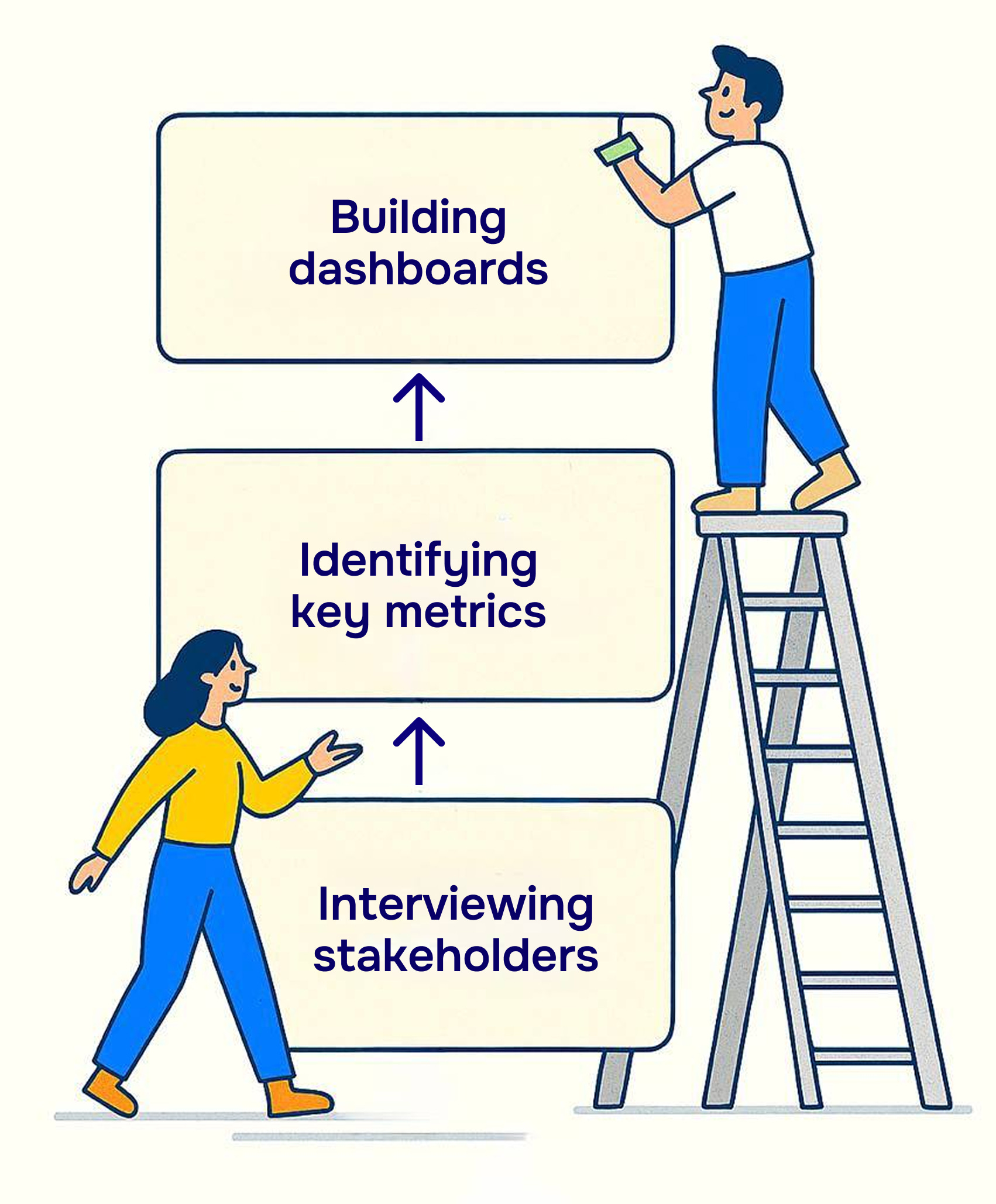
Let’s take this dashboard we made for a client:

They came to us overwhelmed: too many credits issued, no way to track them, and no visibility into how long shipments were taking — or where things were breaking.
We didn’t start by opening Tableau.
We started by interviewing stakeholders across ops, finance, and logistics to understand:
What decisions they were trying to make
Where they were flying blind
What “good” would actually look like
From there, we defined the right success metrics — across credits, insurance plans, ARPU, and transit time — and only then did we build the dashboards.
The result?
They uncovered the most profitable regions to ship to, identified ideal locations for new hubs, and cut average delivery time, nearly doubling customer satisfaction in the process.
Dashboards didn’t drive the result.
Clarity did.
Our 5-Step Dashboard Readiness Checklist
At Valiotti Analytics, we never start with tools.
We start with alignment. Here’s how:
1. Business goals first
Get crystal clear on company-level and department-level objectives. If leadership and execution teams aren’t aligned here, the dashboard will always fall flat.
2. Translate goals into metrics
What does progress look like in numbers? What KPIs actually reflect success? This is where we separate vanity from value.
3. Prioritize filters and segments
Decide how you’ll slice the data: channel, region, campaign, user type. Without this, you’ll end up with a dashboard no one can explore meaningfully.
4. Sketch wireframes
Simple mockups — no code, no design. Just structure. Everyone aligns before anything gets built, which saves hours of rework later.
5. Build slowly — iterate only when needed
Each dashboard serves a purpose. Not five. Not ten. Just one. We avoid the endless tweaks by getting the core logic right upfront.
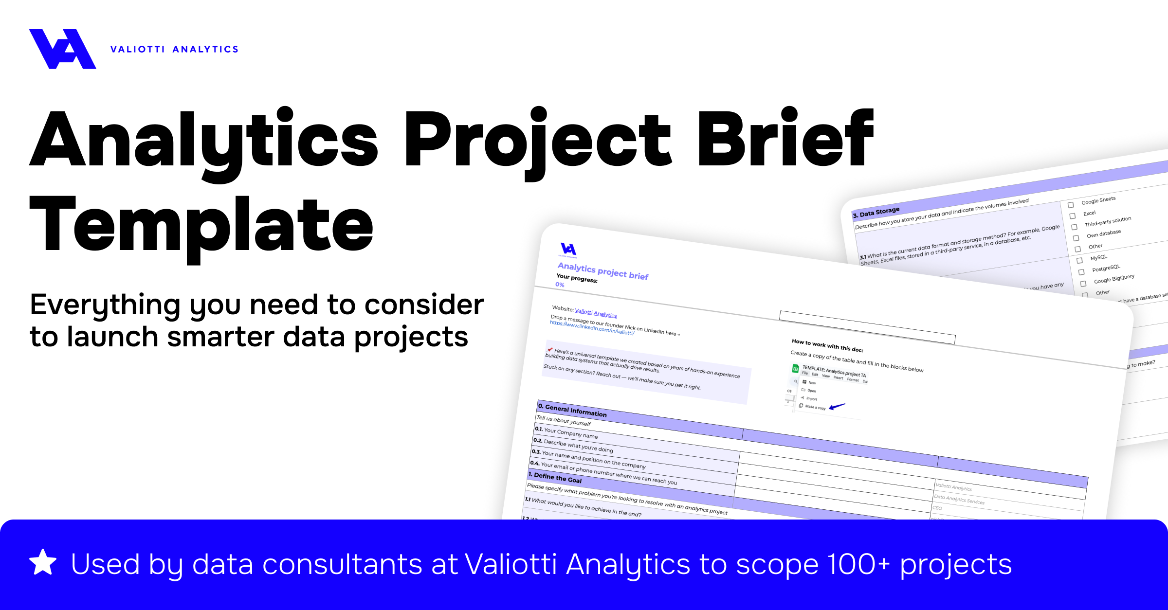
📎 Want to try this process yourself?
We made our BI Brief Canvas public — the exact doc we use to scope every analytics project. DM me if you’d like a copy.
What to Do Before Dashboards
You don’t need a full-stack BI platform to get clarity.
In fact, some of the most useful insights we’ve seen came from tools as simple as Google Sheets and PowerPoint.
Before jumping into a dashboard build, start here:
→ Use Google Sheets to track your core KPIs weekly — manually.
Why? Because manual reporting makes you engage with the numbers.
You’re not just looking at trends — you’re thinking about them. It slows down the process just enough to spot inconsistencies, ask questions, and build real intuition for what matters.
→ Create one-pager PDFs ahead of every review call.
Not 20-slide decks. Not 5-tab dashboards. Just one clear page:
“What happened, what changed, what we’re doing next.”
When everyone’s looking at the same sheet, confusion drops. Alignment rises.
→ Tell stories in slides, not scatter plots.
Dashboards are great for exploration. But when you’re presenting to leadership, clarity wins.
Build a narrative:
What’s the core question?
What did the data reveal?
What decisions do we recommend?
You’re not trying to impress with interactivity. You’re trying to align people around action.
These tools may feel “low-tech.”
But they force what fancy dashboards often miss: focus, alignment, and shared understanding.
Because here’s the truth:
It’s better to have five stakeholders aligned on five numbers… than twenty stakeholders guessing across twenty charts.
Start with simplicity.
You’ll thank yourself later when it’s time to scale.
Pro Tip: One Simple Question
If you’re ever tempted to build a dashboard “just in case,” stop and ask:
“What are the 3–5 decisions this dashboard should help us make?”
If no one can answer that in 30 seconds, you’re not ready.
And that’s okay. Clarity first. Then visuals.
Weekly Roundup
Every week, I share standout posts that challenge how we think about data, dashboards, and the decisions they’re supposed to support.
This week, each piece highlights a different angle of the same problem:
When teams skip the alignment step, even the best tools — dashboards, analysts, engineers — fall flat.
Here’s what caught my eye:
1. “My metric is better than yours!”
[Read the post →]
Slawomir hits on a deceptively simple truth: most data confusion isn’t technical — it’s organizational. The platform’s fine. The pipelines are fine. What’s missing is agreement on what the hell we’re measuring. You don’t need AI to fix your reporting — you need a glossary and a process. Until that’s in place, every dashboard you build is just another flavor of “kind of true.”
It’s exactly why I preach: define success before designing charts.
2. “Some companies have more dashboards than employees…”
[Read the post →]
This one from Ben reads like a therapy session for data teams. Self-service promised empowerment — but in reality, it gave us a graveyard of dashboards nobody trusts, and 30 filters executives refuse to use. His conclusion is brutal but accurate: most self-serve setups don’t serve anyone.
If you’re still building dashboards before understanding the decisions they support, this post will hit hard.
3. “Let’s hire a Senior Data Engineer and see what happens.”
[Read the post →]
Sebastian puts into words what too many execs learn the hard way: hiring technical firepower without a business-aligned strategy is like hiring a Michelin chef with no ingredients and no menu. You don’t need someone to spin up the perfect stack. You need someone who can translate between stakeholders and SQL — fast.
This connects beautifully to today’s issue: you don’t need more tools. You need clarity.
That’s it for this week
If you’ve ever found yourself staring at a dashboard wondering, “What am I even looking at?” — now you know why.
Dashboards aren’t where the work starts.
They’re where alignment shows up.
Start with better questions. Define success before designing charts.
If you found this issue useful, forward it to someone who’s about to request “just a quick dashboard.”
You might save them a month of rework.
Until next time —
Nick from Valiotti Analytics
Nick, THIS is the conversation we need to be having.
You nailed it with the "dashboard reflex". I've lost count of how many founders and ops teams have come to me saying "we need a dashboard" like it's going to solve all their problems. But when I ask them what specific metric would tell them they're winning? Cricket sounds.
They want the dopamine hit of seeing pretty charts. They want to feel like they're "data-driven." But they haven't done the unsexy work of deciding WHAT actually matters to their business.
Your point about starting with "What are the 3-5 decisions this dashboard should help us make?" is golden.
The hard truth: Most businesses don't have a data visualization problem. They have a "we never actually defined what success looks like" problem. And no amount of interactive charts can fix that.
In my experience, you can never get to the really useful set of metrics in the first or even second iteration. Therefore, if building is outsourced by the business owner, even to an internal BI team, there’s already a 90% chance it will be a waste of effort. The only way I’ve seen a dashboard with clear, actionable metrics built is through multiple iterations, with ownership from the business owner in collaboration with a data engineer, and through regular debates around these metrics during weekly or monthly business reviews.