
Why Your Dashboards Aren’t Moving the Business
Vol 13.: On how to turn +30% into a boardroom decision

Welcome to The Datapreneur — the newsletter where we stop guessing, start measuring, and turn raw data into stories that move companies forward.
This week’s issue is for anyone who’s ever watched a team stare at a dashboard showing +30% or –5%… and have no idea what it means for the business.
A metric without a story is like a headline without the article.
It catches your eye, but leaves you guessing.
I’ve seen it happen everywhere — SaaS, eCom, EdTech:
→ Traffic spikes
→ Everyone celebrates (or panics)
→ No one knows why it happened or what to do next
The result?
Data gets observed, but not used.
Let’s fix that.
TL;DR
A metric on its own is just a signal.
A narrative turns that signal into:
→ Context
→ Hypothesis
→ Action
Without it, you’re not driving decisions — you’re just reporting numbers.
The real problem: numbers don’t speak for themselves
We like to think numbers are objective.
You see +15%, and you know what it means.
But in reality, a number is just a raw signal. Without a layer of interpretation, it’s a Rorschach test — everyone sees what they want to see.
Take this scenario:
The dashboard shows “Sales are down 5%.”
The marketing lead says it’s because of a reduced ad budget.
The sales manager says the leads were bad quality.
The CFO says seasonality is to blame.
They’re all looking at the same number.
They’re all telling different stories.
The problem isn’t that the data is wrong.
It’s that the narrative is missing, so the loudest voice in the room fills the gap.
That’s how you get bias, politics, and “data” being used to justify decisions instead of guide them.
Why most companies get this wrong
Three core issues show up over and over:
No context — numbers in isolation are meaningless.
If conversion rate is 3.2%, is that good? Compared to what? Last quarter? Competitors? The goal you set? Without that anchor, people project their own expectations onto the metric.No cause — teams present the “what” without the “why.” They’ll say “Retention dropped,” but never connect it to the churn drivers they could have spotted in segment analysis. The audience is left to guess.
No next step — the slide ends, the meeting ends… and nothing changes.
When a metric isn’t linked to an action, it becomes trivia. It might be “interesting,” but it’s not operationally useful.
In other words — companies collect and display data, but skip the work of using it. And when that gap exists, reporting turns into passive observation rather than a driver of momentum.
Let’s use this dashboard we made for a client as an example:
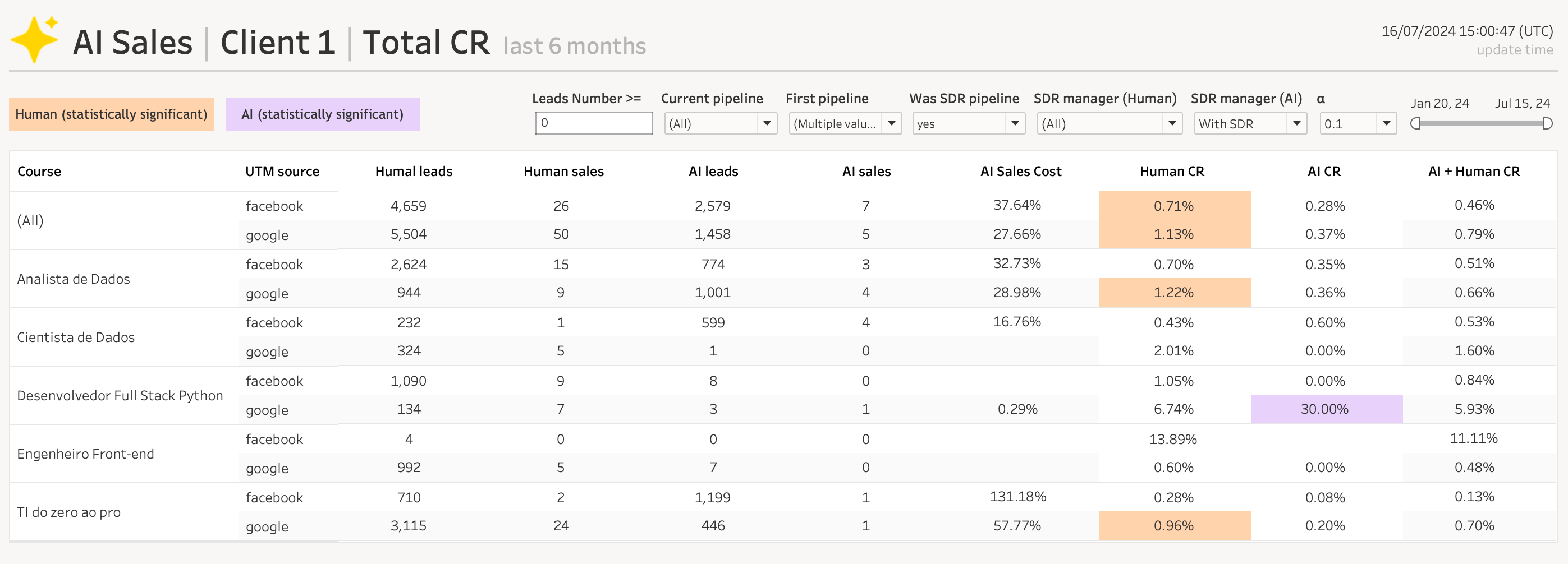
You could say:
“AI CR for Desenvolvedor Full Stack Python (Google) is 30%, human CR is 6.74%.”
…and move on. Everyone nods, maybe someone screenshots it, and nothing changes.
Or you could say:
“AI is converting 4.5x better than humans on Python (Google) leads — let’s route more of this traffic to AI, free up human reps for segments where they outperform, and update bot scripts to replicate what’s working here.”
Same number.
One is an observation.
The other is a decision-making tool with a clear next step.
That’s the difference a narrative makes — it turns performance data from static stats into a plan of action.
How to build a strong narrative around your metrics
When I create a report, I’m not just “showing numbers.”
I’m answering a chain of questions that turns the number into a decision-making tool:
Compare with history
Anchor the metric against a relevant past period.
Example: “This month’s retention rate is 68%, down 4 points from Q2’s average of 72%.”Check the base
Big percentage changes can be misleading if the base is tiny.
Example: “Yes, TikTok leads grew 300% — from 5 to 20.”Add external benchmarks
Without industry context, you don’t know if you’re ahead or behind.
Example: “Our 10% growth is below the market’s 15%, meaning we’re losing share despite growing.”Segment where needed
Aggregate averages can hide the real story.
Example: “Overall conversion rate is flat, but organic traffic converts 3x better than paid — suggesting we should shift budget.”Link to action
Every metric should conclude with a next step.
Example: “We’ll A/B test landing page headlines for the top two underperforming segments next week.”
When you do all five, the report reads less like a scoreboard and more like a playbook.
Adapting the story for different audiences
One number can have multiple narratives — and they’re all valid. The trick is to tailor the story to what matters most to the person reading it.
For a CEO:
Strip away channel details. Link metrics directly to revenue, costs, and strategic KPIs.
Example: “Our Q3 revenue is up 12%, driven primarily by new customer acquisition from email campaigns.”For a Marketing Lead:
Include channel-level drivers, campaign performance, and operational levers they can pull.
Example: “Email drove a 28% increase in new leads, but the webinar campaign underperformed on cost per lead by 15%.”For a Product Manager:
Focus on user behavior and product feature adoption, not ad spend.
Example: “Feature X adoption rose to 32%, doubling retention in the 30-day cohort.”
Same data. Different cuts.
The value comes from aligning the story to the audience’s decisions.
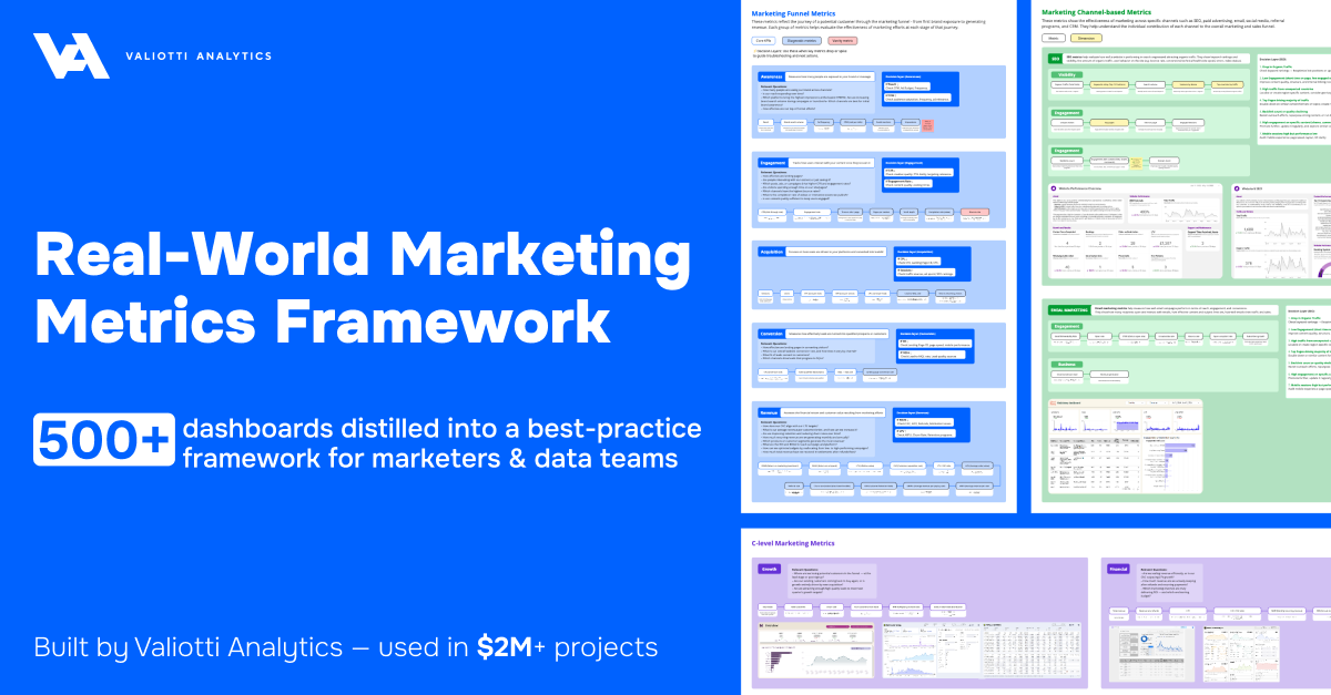
Bonus tip: Want a shortcut to picking the right metrics?
I’ve distilled 500+ real dashboards into one interactive Miro board — organized by funnel stage, channel, and C-level KPIs, with real screenshots and decision layers you can adapt for your own reporting.
Formats that make the story land
A good story still needs the right delivery. We’ve seen the narrative hit harder when it’s packaged intentionally:
Interactive dashboards with annotations
Numbers plus context in the same view. A spike is explained right on the chart, so no one misinterprets it.Presentation decks with commentary slides
Perfect for leadership reviews. Each slide starts with the headline insight and backs it up with supporting visuals.Executive summaries in email
Distill the week/month into 3–5 bullet points:→ What happened
→ Why it happened
→ What’s next
This works when stakeholders have two minutes to read and zero patience for digging.
The right format ensures the narrative doesn’t just exist — it lands with the person who needs to act on it.
Final thoughts
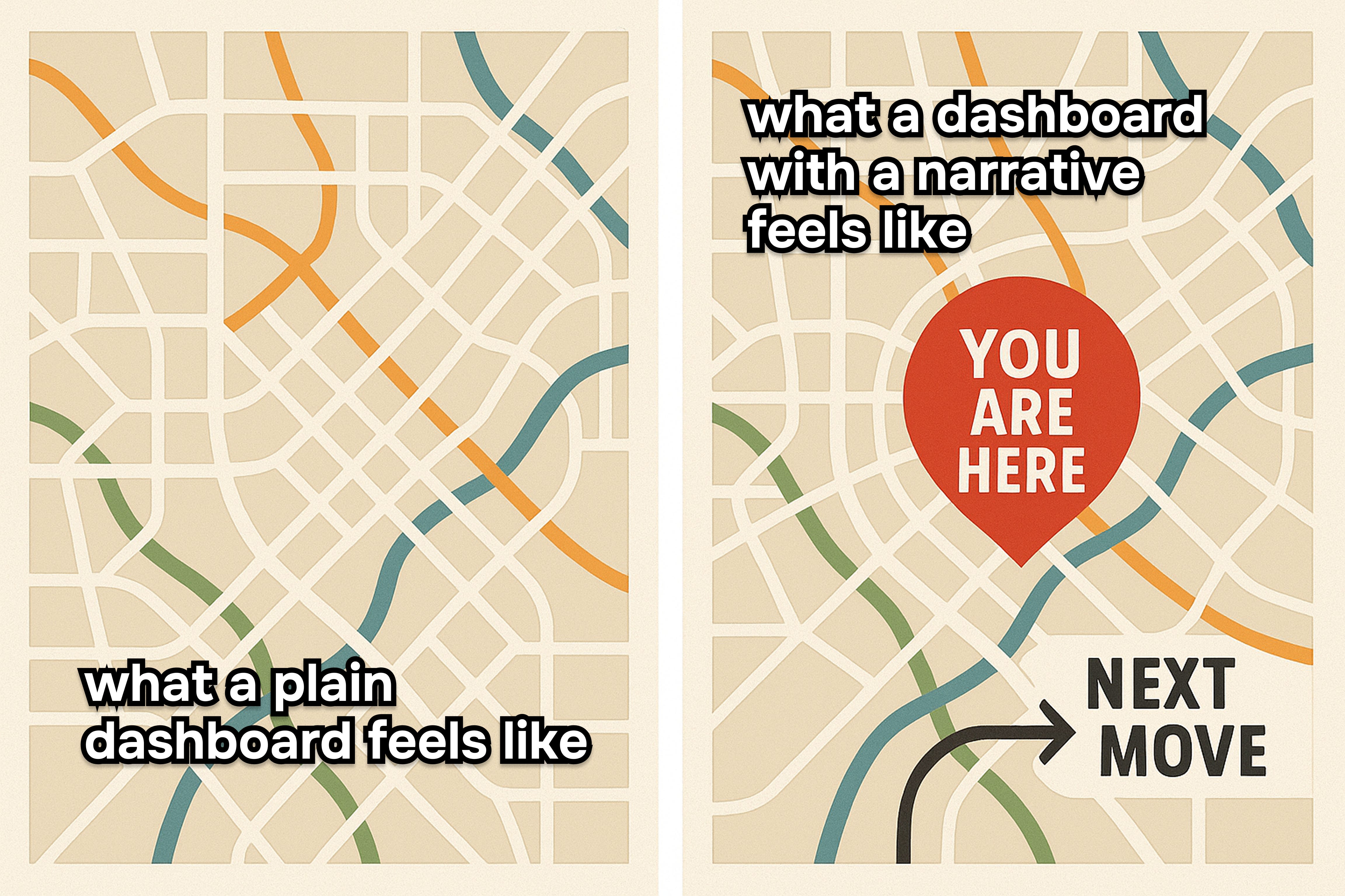
Data is the map. Narrative is the “You Are Here” mark.
Without that marker, you can know every road, every turn, and still have no idea where you are or where you’re headed.
A number without a story will get noticed.
A number with a story will get used.
If you want your metrics to drive change, don’t just report the data — tell the story, name the cause, and point to the next move.
Weekly Roundup
Each week, I share standout posts that dig into the same problem from different angles:
Numbers alone don’t move the business — it’s the story you tell with them.
Here’s what caught my eye:
1. “Data storytelling is like music.”
[Read the post →]
While it’s more of a pro-tip on how to deliver insights, Gilbert nails a truth most analysts overlook — data delivery needs rhythm.
Short, sharp insights. Slow builds. Strategic pauses.
It’s not enough to throw slide after slide of metrics at your audience — you have to compose the story so they feel the turning point and understand why it matters.
That’s exactly what makes the difference between “Traffic is up 20%” and “Traffic is up 20% because X worked — so here’s what we’re doing next.”
Also an incredibly poetic take on data storytelling.
2. “If they only see us as the ‘report guys’… we’ve already lost.”
[Read the post →]
Tris reminds us that without a narrative role, data teams get stuck justifying other people’s decisions instead of shaping them.
The fix? Don’t wait to be asked for a number — bring the insight into the strategy conversation before the question’s even on the table.
Because if your story starts after the decision is made, it’s already too late.
3. “Stop proving you worked hard — start proving what to do next.”
[Read the post →]
Morgan captures the analyst’s rite of passage: moving from over-explaining every metric to showing only what drives a decision.
Think of your report as a pitch, not a receipt.
The goal isn’t to showcase how much data you’ve processed — it’s to make the next step obvious.
4. “Dashboards aren’t data stories.”
[Read the post →]
Kat’s post just reinforces my point: dashboards have value, but they rarely give context, and the story can shift every time the data updates or filters change.
Sometimes, the clearest story isn’t told in the dashboard at all — it’s in a one-pager, a presentation, or a conversation that connects the dots for the audience.
The key is knowing when you need exploration, and when you need a decision.
5. “Always end with a call-to-action.”
[Read the post →]
Donabel keeps it simple: executives are decision-makers, so don’t end your presentation with a number — end it with a recommendation.
“Based on the data, we should…” is the line that turns a metric from observation into action.
If you don’t give them the next move, someone else will… and it might not be the right one.
That’s it for this week
If you’ve ever shared a metric and watched it vanish into the meeting void, remember: the number is only the start. The real impact comes from the story you wrap around it — the context, the cause, and the clear next step.
Numbers get noticed.
Stories get used.
If you know someone who’s still sending “+20%” with no explanation… forward them this before they hurt themselves.
Until next time —
Nick from Valiotti Analytics